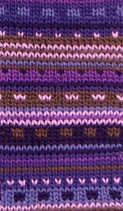
Reworking
Bacardi’s Color Chart
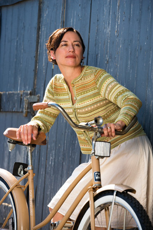 |
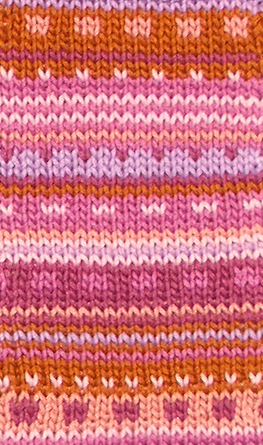
The original Bacardi
[photograph from No Sheep for You,
© and
courtesy Interweave Press] |
Color is a wonderful
and powerful force in the world of knitting.
I believe all knitters love color, and it
can play as big a part in their knitting
decisions as the fibre or the garment’s shape. A shawl or sock pattern
that got passed over when shown in one color
may suddenly become desirable when seen in
one of the knitter’s favorite colors.
This is one of the reasons we love to knit:
whatever we are making, we get to choose the
color.
A few years ago I decided
to knit myself a cardigan. I had a generous
stash of Super 10 Cotton, but no two skeins
were the same color. Wanting something simple
to knit I decided to make it striped, and
to break up the visual tedium of stripes
I mixed in dots and dashes. I chose from
among the warm tones that suit me best. Dark
gold, olive green, a pale, creamy yellow:
these are old favorites for me. A light,
sandy neutral helped to tone down the mix
and keep it from being too intense. A bright,
lime green, used sparingly, was a pleasing
accent. And finally a sage green — in
the context of the warmer tones it appeared
almost turquoise, and looked so pretty next
to the cream or the gold that it secretly
became my favorite child in this little family
of colors.
Not long after I finished
knitting my cardi I heard of Amy Singer’s
call for design submissions for her upcoming
book No Sheep for You. I submitted photos
and was delighted when my design was accepted.
My B-cardi became Bacardi, out there in the
world for anyone to knit. But as you may
know, not everyone likes lime green.
It is one thing to
see a garment in a single color and imagine
it in another. It’s
like being in a store, seeing a lovely garment
and asking “Does this come in pink?” For
the knitter the answer is always “Yes,
if that’s the color you want”.
But what if you see a multi-colored pattern
you like, a garment you want to knit, but the
colors aren’t the ones that flatter you
and coordinate with your wardrobe? How would
you go about picking six new colors to knit
Bacardi?
Unfortunately there
is no scientific process or magic formula.
Color is subjective, and there are no right
or wrong answers. One person’s
winning combination may well contain another’s
least-liked colors. In the end, the “right” color
combination is the one that most pleases you,
or the lucky recipient of your knitting efforts.
So how should you tackle
the problem of knitting Bacardi in another
color palette? For a start, you can rest
assured that you will have no shortage of choices.
The yarn I used, Super 10, is available in
more than a hundred colors. I know some knitters
who like cool greens and blues, so let’s
look at a portion of Bacardi’s chart
and try substituting some colors. Because
the original colorway used an analogous color
scheme (which means that the colors are adjacent
or fairly close to each other on the color
wheel) we will stick to blues and greens
to start with.
If you search Knitty’s
archives you will find some excellent articles
about color theory. Here is a quick review
of the three terms used to define the properties
of a color: hue, value and saturation.
• Is it red, green, or blue? You are
talking about hue. Imagine a rich crimson and
a pale pink mixed from the same red — they
have the same hue.
• Is it light
or dark? You are talking about value. The
pale pink and crimson have the same hue but
the pink is much lighter in value.
• Is it pure, intense color like an artist’s
paint right out of the tube, or has grey,
white or black been added? Saturation is
also referred to as intensity, purity or
chroma. Besides being lighter in value, the
pale pink is also much less saturated because
it contains lots of white.
In this process of creating
a new colorway, we will, naturally, be changing
the hues. Do not worry too much about saturation.
If you love bright, intense colors you may
find that all six of the colors you will
choose are highly saturated, but subtle,
muted or “dusty” colors
are beautiful too and might find a place
in your colorway. Value will be an important
consideration for each yarn chosen. It doesn’t
matter if each color we choose has the same
value as the color it replaces in the original
chart, but all the new colors should be placed
in the chart according to their values relative
to each other.
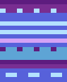
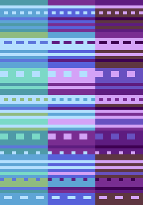
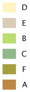 Here
is a representation of the six original colors,
arranged from lightest to darkest ---> Here
is a representation of the six original colors,
arranged from lightest to darkest --->
For color D we need one color that is lighter
than all the rest to provide the highlight
of the palette. The lightest color in the original
chart is Maize, a pale creamy yellow. The darkest
color, A, is Gold; it has the same hue, yellow,
but is darker in value. To imitate this relationship
in our new colorway [below] we will use a pale
blue as D, the lightest color and a periwinkle
blue as A, the darkest. There are many darker
blues, and nothing wrong with choosing one
of them, but keeping our darkest color relatively
light will copy the look of the original design.
In the original palette,
color B is Granny Smith, a light, saturated
lime green which accents the other colors.
Not a rule, but a suggestion: don’t be afraid to include
one color that is a bit different, and maybe
not your favorite. This color represents less
than 14% of the stitches in the chart. You
will never see a lot of it, but it can spice
up the color mix if there is one that is a
little brighter, warmer, or cooler than the
others. In our new colorway, B becomes Sage
Green. It isn’t more saturated than the
others, but it is the warmest. It appears to
be a warmer green in the context of the cooler
blues and turquoises than it does on its own.
For the three remaining
colors, E should be “relatively
light”, C “medium” and F “relatively
dark”. In place of the original Flax
[E], we’ll
use a turquoise that is fairly light but still
holds its own against the lightest blue. The “medium” [C]
is an in-between blue in place of the original
Sage Green, and “relatively dark” [F]
is a darker blue-green instead of the original
Peridot.
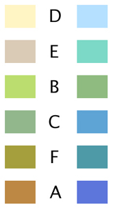 Here
is how the colors compare, from light
to dark... Here
is how the colors compare, from light
to dark... |
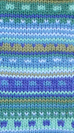
...and
here is a swatch in our new blue-green colorway.
|

|
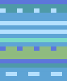
Let’s
look at another example in which the
values are again similar to the original
but the hues have been changed -- this
is sunset.
|
|   Looking
at a portion of these new charts next
to the original one [on the left of the
three], it is clear that the lightest
and darkest stripes and dots play the
same role in each version. The contrasts
between the other colors are not identical,
but the look of the original design has
been maintained. Looking
at a portion of these new charts next
to the original one [on the left of the
three], it is clear that the lightest
and darkest stripes and dots play the
same role in each version. The contrasts
between the other colors are not identical,
but the look of the original design has
been maintained.
|
This doesn’t
mean you must restrict yourself to light
colors. Perhaps you
would prefer to have some purple with
your blues. Let’s remove the green
and turquoise yarns from the blue-green
colorway and add three purples: a light
lilac, a bright intense purple and a
darker purple. The three blues used in
the blue-green colorway remain, but they
will not necessarily go in the same places
in the chart. The pale blue is still
the lightest color, so it remains as
D, but two of the purples are darker
than the blue that was formerly A, our
darkest color. |
 Here are the colors,
again from lightest to darkest. Here are the colors,
again from lightest to darkest.
|
There is now more
contrast in the pattern because there
is a bigger range of values from lightest
to darkest -- this is blue-violet.
|
|
|
|
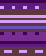
Now
we’ll change a few of the colors
again. The three blues are replaced by
two more purples and mocha brown. The
light lilac is now our lightest color,
so it becomes D, and what was previously
the darkest purple moves to F, to make
room for an even darker plum in the role
of A. Call this one purples.
|
The overall tone
of this colorway is darker than the others,
but the colors are still placed in the
chart according to their relative values.
|
When choosing colors, be aware of the way
a color can change depending on what other
colors surround it. You might pick up a cool
purple to put with some reds and find it now
looks more blue than purple. The best way to
predict how your six colors will work together
is to physically put them together. You might
try winding several strands of different colored
yarns around a finger and squinting at the
result to see how you like the effect. Of course,
the way to know for sure is to knit a swatch.
Some knitters may be wondering about the
software I use for these charts. It is Stitchpainter,
by Cochenille. I find the interface clunky
and the application’s lack of sophistication
can be frustrating at times. However it is
a great help to be able to take a chart like
this one, and with one click change every stitch
of pale blue to lilac. This software is a useful
tool for experimenting with colors in a chart.
What happens if we try pinks with purple rather
than blue? Or reds instead of pinks?
Obviously, the options are almost endless and
this can be daunting. If you are looking for
inspiration, notice the colors in a favorite
piece of artwork, a printed fabric or a hand-painted
skein of yarn. If you can get to a yarn shop
with a good selection of colors, take your
time and find a spot in good light, preferably
natural daylight. Get out skeins of all the
colors you think might work. Try starting with
a dark, a light and a bright, and then switch
the skeins around until you find six that work
together to make your heart smile.
|