|
Knitting with two strands of yarn held together is a standard way to use a fine yarn in a pattern that calls for a thicker yarn. But it’s also an opportunity to play with color to create iridescence, harmonize unrelated colors, build new colors, and mimic the richness of variegated yarns.
One of the reasons that variegated and hand-painted yarns are popular is that the human eye loves subtle variations in color. If you look at the natural world, you will find dozens of greens in a single leaf.
Modern chemical dyes can create perfectly leveled and uniform color, but the downside is that sometimes these yarns appear flat and uninteresting. Color blending, however, can have you looking at your stash in a whole new light.
In order to talk about color theory, we need to agree on some terms:
- Hue:this is what we usually mean by color (green, blue, orange, etc.)
- Value:how light or dark the color is (dark green versus light green.)
- Intensity:how pure the color is, a low intensity color is sometimes described as murky or complex, a high intensity color is very “neon” (olive green versus pure green)
Varying Hue
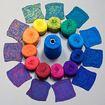
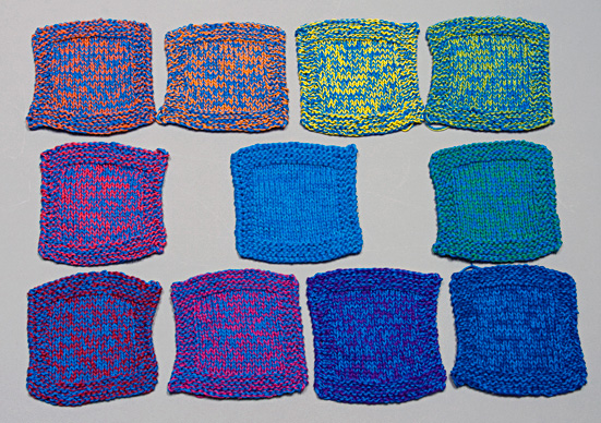
To explore hues in color-blending, I created a color wheel out of a given yarn (details under Resources at the end of the article) then picked a rich blue as my blending color. I knitted a swatch for each color in the color wheel that combined my blending color with each hue.
As you can see in the picture above, this created a new set of colors that shifted towards blue.
Orange is the opposite color from blue on the color wheel (blue’s complement), and as would be expected, created vibrant color combinations. These could be fun in kids clothes, but probably aren’t what you want for elegant evening wear.
Colors that are next to blue on the color wheel create a subtle and rich look.
You can see how, using a single blending color can create a rich and unified palette out of yarns that might otherwise not go together.
To apply this concept in your knitting, you choose a color you like (or a neutral color) and knit it as the blending color while you swapped the second colors in and out. It would be a great way to harmonize stash yarns into a cohesive color grouping.
It would be fun to redo this exercise using each hue in turn as the blending color, to see all the possible color combinations.
Varying Value
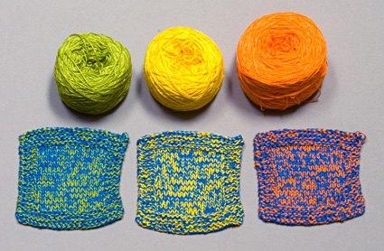
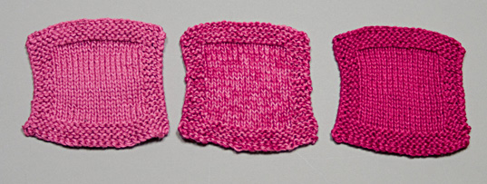
Another fun thing to do is to keep the hue constant and vary the lightness and darkness. This creates a monochromatic color palette.
You can see in the photo above, how the blended color is more rich and lively than the swatches knitted with a single color.
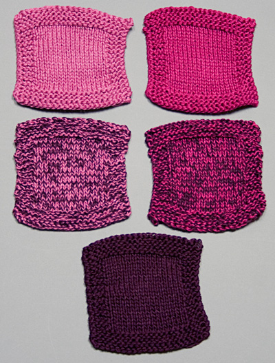
You can also use a darker color to tone down two bright colors. Those leftovers from your spring knitting can be mellowed into something that works for fall.
A strong value contrast (navy and a lemon yellow below) creates a dramatic fabric.
Playing with value contrasts can be a way to get a heathered look or to mimic the look of a variegated yarn, but without the awkward pooling and striping you sometimes get.
You could also use subtle value changes to create shading in knitted garments, to create contours that, for example, emphasize or de-emphasize curves.
Iridescence
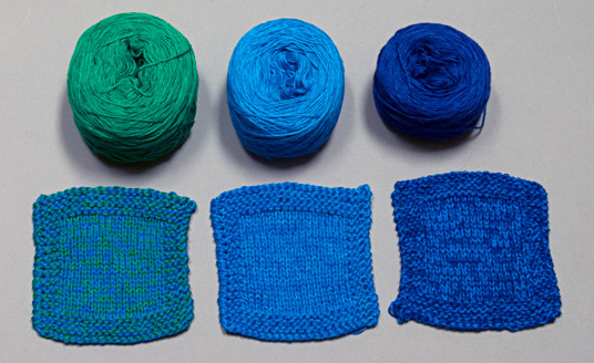
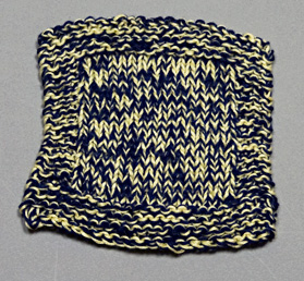
Iridescence happens when you create a knitted fabric out of two yarns closely related in hue and value. Your eye bounces back and forth between the two colors and sees a beautiful shimmer.
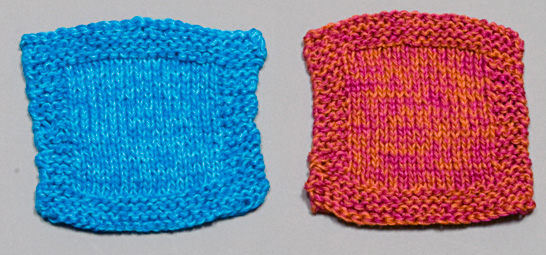
To create iridescence using doubled yarns, pick two colors that are close in value or hue. You need a subtle variation to create that shimmer. The picture below shows iridescence created by subtly varying value (blue swatch) and by subtly varying hue (orange and pink swatch.)
Last Word
Knitting with a doubled yarn and using two different colors is a fun way to play with color. You can create new colors, blend colors together, and create interesting effects. When I was swatching for this article, there were several surprises along the way. Sometimes the most unlikely color combinations were the most stunning.
I hope you'll consider adding color blending to your knitter’s toolbox.
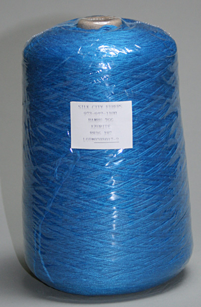
Note: A side benefit of using multiple strands is that you can start shopping in weaving yarns. Doubled Silk City Bambu 7 (the yarn used for this article) creates a luscious fabric and comes in 20-ounce cones that contain 2625 yards. Imagine knitting an entire top or skirt without a single join!

Resources
Colors in first photo:
#565 China Red
#039 Watermelon
#885 Pumpkin
#980 Tangerine
#606 Sunflower
#797 Lime
#521 Emerald
#034 Apache Blue
#297 Chagall Blue
#557 Emperor Blue
#603 Pansy
#136 Magenta
Blending color: #187 Azurite
Can’t get enough color theory? Here are my favorite books on the subject:
- Color and Fiber by Patricia Lambert, Barbara Staepelaere, and Mary G. Fry, 1986, Schiffer Publishing Ltd.
- The Magical Effects of Color by Joen Wolfram, 1992, C&T Publishing
- Color Works: The Crafter’s Guide to Color by Deb Menz, Interweave Press
- Color in Spinning by Deb Menz, Interweave Press
|