| For many years,
possibly too many, I have read and read about
color theory, and the use of color, and how
painters and dyers and potters and weavers and
designers and landscapers and everyone in the
universe chose colors. Until recently, none
of the information did me any good; how other
people did things was all well and good, BUT
WHAT WAS I SUPPOSED TO DO WITH THE INFORMATION?
Hue, intensity, shade, tint, tone, value, saturation,
chromaticity?? All I want to do is knit a two-color
sweater that doesn't look like a train wreck,
not paint the Mona Lisa. So I read, and muttered
foul things under my breath, and experimented,
and finally, after a chance comment in one of
Sally Melville's books, an article on how the
brain sees color, and (hopefully) my own intellect
finally kicking in, I figured out a way to use
color theory that was easy and worked. It doesn't
even involve the color wheel, though a black
and white copier or scanner may be your new
best friend.
This technique isn't really
cheating. It's a valid method of using what
people through history have learned about color,
and applying it to our knitting. But it's so
easy, it feels like cheating, especially when
the results work, time and time again.
It's all about value. Well,
okay, it helps if your hues match too, but I
like wearing pink and orange together so 'match'
is a relative term. But my days of having colors
blend when I don't want them to, and having
them stand out like a sore thumb when I want
it to blend, of having to knit gauge swatches
over and over and over to find colors that worked,
ah yes, those days are over.
First, though I hate to do
it to everyone, we're going to have a quickie
review of color theory terminology. I promise
to make it as quick as possible, and in return
I would appreciate it if you don't cry or send
me hate e-mail. Take a look at the color card
illustration. There are three factors at work
there; at least, three factors we're interested
in. (A note in my defense -- these terms were
developed by painters, for painters, and I unfortunately
have to use a little bit of painting terminology
to explain them. Galling, but there it is.)
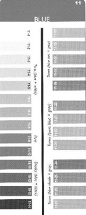  Hue:
This is what we traditionally think
of as the color, and what I mean in this article
when I say color. In this case, blue. With dying
or painting, all of the samples on that color
card would be produced with the same pigment.
Ergo, they're the same hue. Hue:
This is what we traditionally think
of as the color, and what I mean in this article
when I say color. In this case, blue. With dying
or painting, all of the samples on that color
card would be produced with the same pigment.
Ergo, they're the same hue.
Intensity:
Brightness. In the paint or dye case, how much
pigment is actually there. Also called saturation,
which dyers would probably understand better.
The longer in the dye pot, the more saturated
the hue, and the more intense the color. Like
that.
Value: Our
best friend. And the hardest to define. Think
of it as the underlying gray scale, because
that's exactly how we're going to use it. I
often think of it in terms of pastels, brights,
and darks; it's a little more complex than that,
but for most knitting purposes, we don't have
to get into the details. (To veer off into painterland
again, artists used to paint their works in
grays before doing it again in color, to understand
what values they wanted, where. This is the
underlying sneakiness that makes you focus on
what the painter wants you to look at: the sky,
the face of the saint, the piece of pottery
in the still life that seems to glow.)
Those are our three terms.
We'll be dealing almost entirely with value
and occasionally hue, so if you wanna
forget about intensity you probably
can. There isn't a test later. I hear you in
the back, muttering about more useless color
terms. Not true. Check this out.
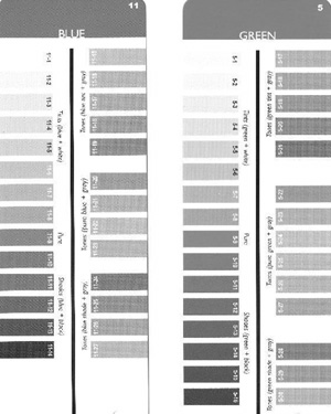
Take a gander at the black
and white version of the blue color card [shown
above right]. (I put it through the scanner
on gray scale instead of color -- you can also
shove yarn samples, color cards, and swatches
into a black and white copy machine.) See the
wide variety of grays produced by the same color?
That's all you need to know. Want to knit a
two-color blue sweater? Use a light blue, like
11-4, and a dark blue, like 11-24, and it's
guaranteed to work out; the colors will be distinct
from each other and you will have saved a boatload
of time spent fooling around with swatching.
  Okay.
What if you want to do a blue and green sweater? Okay.
What if you want to do a blue and green sweater?
What are you gonna do now?
Hmmm?
Put it all in the copier,
that's what.
Pick a color off each card,
one in a light value, and one in a dark value.
Say, 11-10 from the blue card and 5-4 from the
green card. Bingo. Off you go. It's not THAT
exciting with two colors, but it gets more useful
when you're using multiple colors, in which
you're trying to blend within groups but have
them stand out from each other, like in Fair
Isle knitting. You want the background and the
foreground to move beautifully through color
graduations, but you want them to be distinct
from each other. Back to your copier with your
yarn samples!
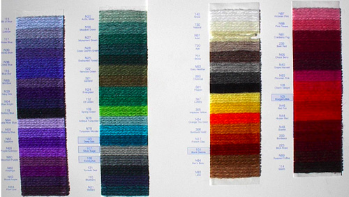
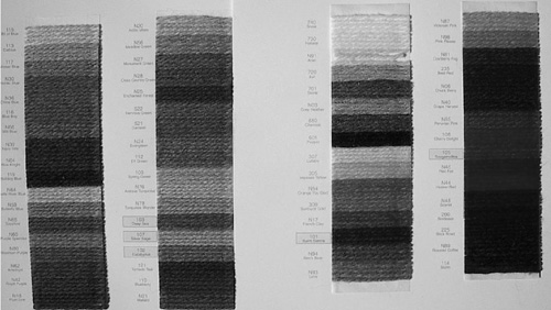
For a blended background,
how about orange, Peruvian pink, and cherry
delight? (Medium gray.) For the contrasted foreground,
Bit of Blue. (Very light gray.) And voila:
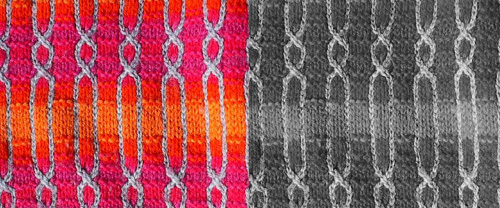
Unfortunately the broad, lighter
orange stripe in the center is discontinued
and not on the color card; however you can see
in the color to gray scale comparison that it
doesn't blend as well as the other three background
colors. I did this sweater before I understood
how value worked, and I'm shocked that it's
as good as it is. Sometimes we get lucky.
And sometimes, we don't.
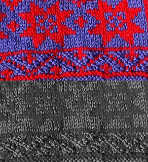
Now that you know what to
look for, you know what the problem is; the
colors in the swatch are too close in value.
Not the worst combo ever, but not great, either.
Often when you put saturated colors of the same
value next to each other, you get 'flashing
colors', when your eyes cannot focus on the
edge between the two colors and your eyes get
all squidgy. Sometimes that's a cool thing,
if that's what you're going for (art and clothing
in the 1960s exploited this effect). In the
case of traditional knitwear like the swatch
above was supposed to be, it's definitely not
a good thing. But it gets worse. Check this
out:

This was supposed to be a
sweater for my dad. Hahahahaha. At least now
I know what in heck went wrong.
Where this method really shines,
though, is in copying the genius of others.
Behold, a Bohus Stickning sweater.
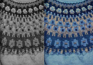
Those folks knew color. See
how each band has its own distinct background,
with accents in something sure to show up? Check
out the center band; there are several blended
colors at work there, with spots of dark blue
to catch the eye. Pure genius. And if you wanted
to copy it, all you'd have to do is shove your
yarn sample card in a copier and choose the
proper value colors. If I were doing this in
green, I'd use a very dark green for the bottom
band, a slightly lighter green for the top band
(I never would have caught that value shift
without the gray scale picture), and a VERY
light green for the body of the sweater. The
center band? Two different colors of nearly
identical value. You'd still have to work at
the colors a bit, but with the gray scale to
cheat, the idea of shifting colors possible;
without the values, I wouldn't know where to
start.
The reason this works has
to do with how your eyes and brain see color.
The human retina (essentially the 'receiver'
at the back of the eyeball) has two types of
light receptors: cones and rods. Cones see color,
and differentiate the hues and intensities.
Rods see gray scale. (The cones don't work in
low light; that's why in the dark everything
looks black and white.) The way we normally
think of color involves only that -- color.
The cones. But by paying attention to value,
we play to the entire visual ability, cones
and rods, and the brain can interpret what's
going on twice as well. And YOU will be twice
as happy with your color choices.
Thanks to modern technology,
figuring out value is easier than it ever has
been. Black and white copiers are nearly everywhere
now, including yarn stores and private homes.
Most yarn stores will copy your yarn combination
for you, if you ask nicely. (They may look at
you strangely, though.) Even shopping on line,
it's fairly easy; just print out the page of
yarn colors on your black and white printer.
Instant values for the whole page of yarns.
(No one's ever done a study that I know of,
but I'll bet you that the values on your computer
monitor are more accurate than the colors are.)
Once you get in the groove and start paying
attention, you can often guess values without
having to find a copier, and will start using
the information when you're yarn shopping. That
is when you know you have arrived. Have all
your friends call you Color Sensei and bow when
they see you. Or better yet, give you yarn.
NOTES:
- Color card scanning
done by Steve the Wonder Husband. All other
photos by the author.
- Color cards are from
the 3-in-1 color tool available from
Elann.com.
- Yarn sample cards from
Brown Sheep.
- "The Purl Stitch"
by Sally Melville contains the comment that
got my brain in gear; she suggests that if
you don't like the color of a sweater shown
in a pattern, to copy it in black and white
and look at it that way. (In the comments
on "Another Coco Jacket".)
|

