You've seen those multi-color
patterns. They're not written:
CO BLUE, work
rib for 2 inches, switch to PINK
No, no, no, they're written:
CO MC, work
rib for 2 inches, switch to CC1
The implication being that
you can use any MC and CC1, 2, and 3 that you
like. Those of you with an artistic bent or
an adventurous spirit might happily grab colors
off the shelf and start knitting away, but what
if the colors don't go together? It's an awful
lot of effort (and cost) to knit a whole sweater
just to discover that the colors clash. So you
have a choice: you could just stick with the
colors in the picture -- after all, they don't
look like the dog's breakfast -- or you could
learn a thing or two about color theory.
Color is notoriously difficult
to talk about. I once had a heated argument
over whether to use royal blue or electric blue,
and when I finally grabbed a magazine to show
this person what royal blue looks like, he said
"Yeah! That's electric blue!" So my
telling you that royal blue looks lovely with
daffodil yellow is useless.
We need better words, so allow
me to introduce some technical terms.
Just like space has three
dimensions, so does color. And just as a choreographer
plays with the dimensions of space to create
an interesting dance, a designer (that's you!)
can play with the dimensions of color to come
up with a pleasing combination.

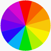
The Dimensions of Color
 The
first dimension is Hue. This is the general color family, say, blue as opposed
to red. All the hues are arranged in a nice
rainbow around the typical artist's color wheel,
and you can have a lot of fun with this wheel.
There's the warm side, and the cool side, though
I've heard plenty of debate over exactly where
each side starts. (Is green warm or cool? What
about purple? Maybe we should call them "tepid".)
Hues that fall opposite each other on the wheel,
such as blue and orange, are called "complementary"
and they enhance each other while providing
dramatic contrast. Hues that fall beside each
other, such as orange and yellow, are called
"analogous" and they appear to blend
into each other. Theoretically, there are an
infinite number of hues, as each hue blends
into its neighbor.
The
first dimension is Hue. This is the general color family, say, blue as opposed
to red. All the hues are arranged in a nice
rainbow around the typical artist's color wheel,
and you can have a lot of fun with this wheel.
There's the warm side, and the cool side, though
I've heard plenty of debate over exactly where
each side starts. (Is green warm or cool? What
about purple? Maybe we should call them "tepid".)
Hues that fall opposite each other on the wheel,
such as blue and orange, are called "complementary"
and they enhance each other while providing
dramatic contrast. Hues that fall beside each
other, such as orange and yellow, are called
"analogous" and they appear to blend
into each other. Theoretically, there are an
infinite number of hues, as each hue blends
into its neighbor.
But you wouldn't go to the
hardware store and ask for blue paint. You might
say "dark blue" or "intense blue"
or you might even ask for "dark, intense
blue". This is where the other two dimensions
come in.
 Value
is the second dimension, and it refers to the lightness or darkness of
a color, or how close the color is to pure white
or pure black. Pastels are considered "high
value " colors, because there's a lot of
white in them. Colors you'd see in a hunting
lodge -- all that burgundy and navy and forest
green -- are called "low value" because
they contain a fair amount of black.
Value
is the second dimension, and it refers to the lightness or darkness of
a color, or how close the color is to pure white
or pure black. Pastels are considered "high
value " colors, because there's a lot of
white in them. Colors you'd see in a hunting
lodge -- all that burgundy and navy and forest
green -- are called "low value" because
they contain a fair amount of black.
If you were to play with some
paints (and I highly encourage it -- there's
no better way to learn about color), this is
where you would add white or black to a hue
and see what it did. It might not do what you
expect! It's easy enough to think of a dark
blue, but would you think that yellow + black
= olive green? Grab your paints and find out.
A hue with white added to
it is called a "tint". A hue with
black added to it is called a "shade".
(The next time someone refers to pale mint as
"that particular shade of green",
you can roll your eyes knowingly.)
 The
last dimension is Saturation, also known as Chroma. This is how intense the color is, whether it's closer
to a fire engine or a filing cabinet. Fully
saturated colors are pure, bright hues, like
the ones you see on the color wheel. The least
saturated colors are known as "achromatics",
meaning without color. You'd probably call them
greys. Colors with a medium saturation are somewhere
in between. Get out your paints again, take
a pure hue, and add grey. A hue plus grey is
called a "tone". Another way to tone
down or "desaturate" a color is to
add its complement (red to green, purple to
yellow). It's trippy, but it works.
The
last dimension is Saturation, also known as Chroma. This is how intense the color is, whether it's closer
to a fire engine or a filing cabinet. Fully
saturated colors are pure, bright hues, like
the ones you see on the color wheel. The least
saturated colors are known as "achromatics",
meaning without color. You'd probably call them
greys. Colors with a medium saturation are somewhere
in between. Get out your paints again, take
a pure hue, and add grey. A hue plus grey is
called a "tone". Another way to tone
down or "desaturate" a color is to
add its complement (red to green, purple to
yellow). It's trippy, but it works.
A good way to judge the saturation
of a color is to ask yourself "How bright
is it?" or "How intense is it?" You probably find yourself drawn to a
certain saturation level. If you're happiest
in your bright fuchsia t-shirt, then you're
someone who likes high saturation. But if your
sister's bright fuchsia t-shirt gives you a
headache, then you might want to stick with
less saturated colors. Also, remember that a
highly saturated color packs a lot of punch.
A lipstick red really livens up a bunch of grays.
You can mix a bright red with a bright blue and a bright green,
but you'll be approaching the world of cartoons.
A great place, if it's where you want to be.
Extra credit: You can have
a relatively unsaturated color at any level
on the value scale, but the most highly saturated
color in each hue family lives at one point
on the value scale, and it's not the same point
for each hue. Sound complicated? Follow me,
here. Take the color wheel, and squint at it
(you may feel silly, but it's the best way to
judge values without being too distracted by
the hues.) If that doesn't work for you, photocopy
it, to get a black and white version. Doesn't
the pure yellow look fairly "light "
and the pure purple fairly "dark "?
To recap, we've got three
dimensions of color: hue (name of color), value
(lightness or darkness) and saturation (brightness
or grayness). I might have avoided that royal/electric
blue argument if I'd said "Let's use a
purply-blue of a high saturation and low value".
Or I might have just gotten a blank stare.
Ok, so now it's time to mix
these colors, and we're going to use the dimensions
of color to explore possible combinations. To
begin with, decide whether you want a subtle
or exciting look.
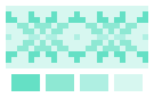
Subtle Color Mixes
For the subtle color mixes,
we're going to vary one dimension slightly while
keeping the other two constant. Stay with me.
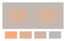
 Hue. For our subtle hue mix, we're going to stick with hues that fall close
to each other on the color wheel. So, pick your
favorite hue (say, orange), and then move out
to include some of its neighbors (red-orange,
yellow-orange, and yellow). Because we're staying
subtle here, you probably want to stick with
a medium to low saturation. Value is whatever
you like, but keep the same value in all your
colors (all light, or all dark).
Hue. For our subtle hue mix, we're going to stick with hues that fall close
to each other on the color wheel. So, pick your
favorite hue (say, orange), and then move out
to include some of its neighbors (red-orange,
yellow-orange, and yellow). Because we're staying
subtle here, you probably want to stick with
a medium to low saturation. Value is whatever
you like, but keep the same value in all your
colors (all light, or all dark).
If you're liking the technical
terms, this is called an "analogous color
scheme".
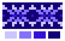
 Value. Ok, now we're going to stick with one hue and one saturation, and vary
the value. Because we're keeping it subtle,
you don't have to go to both extremes of the
value scale. So, pick your hue (blue-green),
pick a value you like (fairly light) and move
outwards in smallish steps (really light, light,
and medium-light).
Value. Ok, now we're going to stick with one hue and one saturation, and vary
the value. Because we're keeping it subtle,
you don't have to go to both extremes of the
value scale. So, pick your hue (blue-green),
pick a value you like (fairly light) and move
outwards in smallish steps (really light, light,
and medium-light).
The technical term for this
is a "monochromatic color scheme".
 Saturation. This is probably the trickiest to imagine. Like before,
we're sticking with one hue and one value, and
only varying the saturation. In this case, it's
probably easier to start with the brightest
color you want (say, a salmon pink, which is
really a medium-high value orangish-red), and
then go grayer.
Saturation. This is probably the trickiest to imagine. Like before,
we're sticking with one hue and one value, and
only varying the saturation. In this case, it's
probably easier to start with the brightest
color you want (say, a salmon pink, which is
really a medium-high value orangish-red), and
then go grayer.
This could also be called
a "monochromatic color scheme", since
it uses a single hue.
Exciting Color Schemes
For the exciting schemes,
we're going to stretch each scale, and even
vary two dimensions at a time. Always keep one
dimension constant, though, or you're back to
chaos.
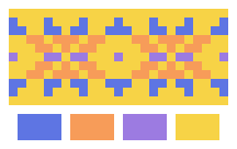 Hue.
Now, the sky's the limit. Use any combination
of hues you like. If you still want some direction,
try using two pairs of complements. Remember,
you find complements by drawing a line directly
across the color wheel. So, say, start with
blue, and find its complement, orange. Then
move from blue next door to purple, and find
its complement, yellow. Or pick a completely
different pair: red and green!
Hue.
Now, the sky's the limit. Use any combination
of hues you like. If you still want some direction,
try using two pairs of complements. Remember,
you find complements by drawing a line directly
across the color wheel. So, say, start with
blue, and find its complement, orange. Then
move from blue next door to purple, and find
its complement, yellow. Or pick a completely
different pair: red and green!
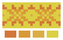
If this is a little too wild
for you, then stick to one side of the color
wheel, but to keep it exciting, go for a wider
range than our subtle analogous color scheme.
An exciting warm color scheme could include
pink, orange, yellow, and a yellowy-green.
Given the variety of hues
available, you might want to stick with the
same saturation and value, but feel free to
vary one if you're feeling bold.
 Value. Pick any hue you like, and go from the top of the value scale to the
bottom, almost-white to nearly-black. Or pick
three notes on a value scale, then throw in
another hue for good measure (which is what
we do under saturation).
Value. Pick any hue you like, and go from the top of the value scale to the
bottom, almost-white to nearly-black. Or pick
three notes on a value scale, then throw in
another hue for good measure (which is what
we do under saturation).
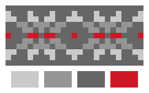 Saturation. The widest possible range of saturation is from fully-saturated color
to a color-that-isn't-a-color: an achromatic,
or gray. Fortunately, the combination of grays
with bursts of vivid color is spectacular. Note
that the three grays constitute a value scale,
while the red and the medium gray are two ends
of a saturation scale.
Saturation. The widest possible range of saturation is from fully-saturated color
to a color-that-isn't-a-color: an achromatic,
or gray. Fortunately, the combination of grays
with bursts of vivid color is spectacular. Note
that the three grays constitute a value scale,
while the red and the medium gray are two ends
of a saturation scale.
Advancing and Receding Colors
I hope that wasn't too much
you to process, because there's more! As you
start fiddling with color combinations, you'll
notice that some color seem to pop out at you,
while others recede into the background. Advancing
colors, the ones that pop, tend to be warm (hue),
light (value), and intense (saturation). Receding
colors tend to be cool (hue), dark (value),
and neutral (saturation).
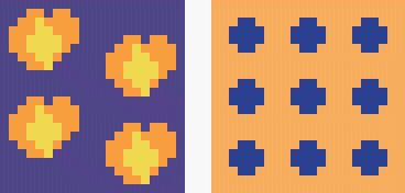 If
you're canny, you can use this phenomenon to
enhance your pattern. How? If you knit yellow
and orange pansies on a dark purple background,
the pansies are going to pop. But if you knit
navy polkadots on a bright salmon background,
the dots will recede, and the overall effect
will be to dim the salmon.
If
you're canny, you can use this phenomenon to
enhance your pattern. How? If you knit yellow
and orange pansies on a dark purple background,
the pansies are going to pop. But if you knit
navy polkadots on a bright salmon background,
the dots will recede, and the overall effect
will be to dim the salmon.
Inspiration Comes
in All Shapes and Sizes
It's delightful to study art
history along with color theory. Color theorists
are constantly setting up rules. The artists,
on the other hand, absorb the color theory of
their day, and then turn around and break every
rule, to spectacular effect.
If you don't want to pull
out a color wheel and try to wade through my
suggestions, just look around you. Paintings,
greeting cards, china patterns, a collection
of pens in a jar, your child's finger-painting
-- anything can be an inspiration for a color
palette. And so what if it doesn't follow a
single suggestion that I've posited? Does it
look nice to you? Does it make you happy? Then
knit it!
Tips on Shopping for Color
There's really only one important
tip: If you're shopping for color, make sure
you can see
the color. I'll spare you the technical details,
but let me just tell you that color isn't even
in the eye of the beholder -- it's in the mind.
If it's your sweater, the colors have to look
right to you. So that means: